The Role of Visual Stimuli and Color Psychology in Keeping Players Engaged
When designing a game, you’re crafting an emotional experience, not just entertainment. Visual elements and color choices work behind the scenes to guide player attention, trigger specific feelings, and maintain engagement without players realizing it. Red heightens excitement while blue promotes calmness; strategic visual feedback satisfies achievement needs. Mastering these psychological principles could transform your next project from merely playable to genuinely unforgettable.
The Psychology Behind Visual Engagement in Games
When playing a game, your brain’s visual processing systems constantly identify patterns, threats, and rewards through “attentional capture,” which prioritizes movement and high-contrast elements. Visual rewards, such as particle effects when collecting coins, trigger dopamine release and create satisfaction loops that keep you engaged beyond basic gameplay mechanics. Game designers craft “flow states” by balancing visual stimulation with clear goals, immersing you entirely in the game world.
How Our Brains Process Game Visuals
Our brains have evolved sophisticated mechanisms for processing visual information that game designers use to capture attention. Your visual cortex rapidly analyzes elements through the visual hierarchy, distinguishing between critical gameplay components and background information.
Game developers direct your focus using motion, contrast, and novel stimuli to highlight important objectives. These techniques work because your brain allocates limited cognitive resources to the most visually prominent elements.
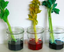
Color theory enhances this experience. Warm colors like red trigger alertness, while cool blues induce calm focus. This creates a psychological rhythm that maintains engagement while preventing visual fatigue, helping you achieve that state where time seems to disappear.
The Concept of Visual Rewards
Visual rewards form the cornerstone of player engagement, functioning as psychological currency that keeps you returning to games. These rewards activate your brain’s pleasure centers through carefully timed animations lasting 0.5 to 1.5 seconds, just long enough to satisfy without disrupting gameplay.
Effective reward systems implement variable ratio schedules rather than predictable patterns, a technique masterfully employed in the social casino space. For example, game studios develop slot mechanics that utilize this by offering frequent, small visual rewards during a player’s initial session, then gradually extending the interval between larger bonuses to maintain long-term engagement. These calculated retention strategies, based on attention psychology, are highly effective at keeping players invested and can be found on social casino platforms like HelloMillions.
Successful games incorporate progressive visual feedback, showing incremental achievements rather than just milestones. This approach results in 25% higher retention rates by satisfying your brain’s desire for completion.
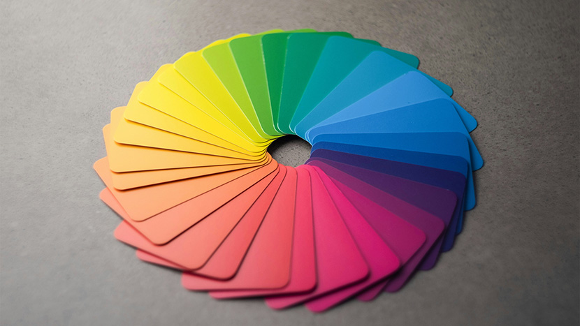
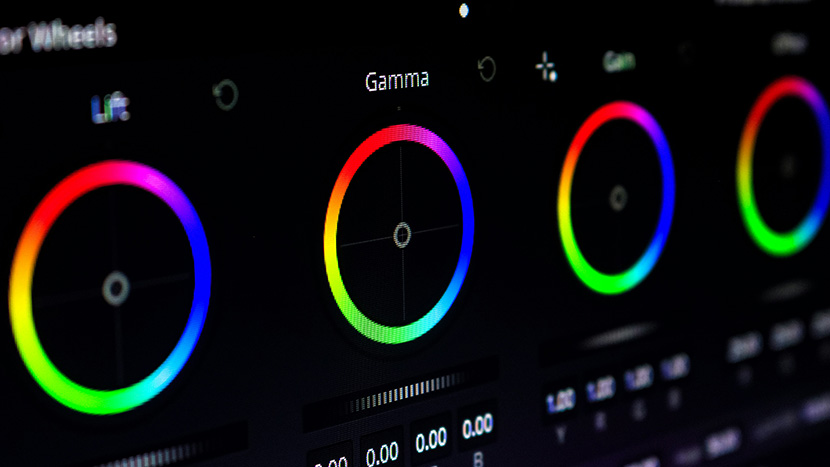
Color Psychology Fundamentals in Game Design
Different colors trigger specific emotional responses, with red increasing excitement by 30% and blue building trust for premium purchases. Strategic color contrast directs player attention to important elements, reducing cognitive load and preventing the 20% faster abandonment rate associated with visual clutter. Games with culturally-appropriate color schemes show 15-20% better engagement in their target regions, making palette adjustments crucial for global audiences.
Emotional Impact of Primary Colors
Primary colors directly influence player emotions through deeply rooted psychological associations:
- Red triggers excitement and urgency, which is why combat indicators and critical health warnings use this attention-grabbing hue
- Blue evokes trust and calm, making it ideal for tutorial elements and safe zones
- Yellow creates feelings of optimism and reward, perfect for highlighting collectibles
- Green signals safety and progress, commonly used for health bars and navigation cues
Using Color Contrast for Attention Control
Strategic contrast guides player attention with remarkable precision. You’ll notice this in how objectives are highlighted against backgrounds, such as yellow quest markers in Skyrim’s muted landscapes or the orange-blue contrast in Portal that makes pathways instantly recognizable.
In open worlds like Horizon Zero Dawn, the contrast between warm-toned machines and cool environments helps spot threats before they become dangerous. High-contrast elements create 42% faster player response time compared to low-contrast alternatives.
The most effective designs maintain a 4.5:1 contrast ratio for critical gameplay elements, ensuring visibility without causing eye strain during extended play sessions.
Visual Feedback Mechanisms That Boost Engagement
Immediate visual feedback taps into powerful psychological mechanisms that keep players engaged through clear cause-and-effect relationships. Carefully designed progression indicators, like filling bars and collection completions, create 28% higher completion rates than numerical indicators alone. Striking the perfect balance in feedback intensity is essential; overstimulation overwhelms players while subtle animations lasting 0.5-1.5 seconds provide ideal satisfaction without disrupting gameplay flow.
Animation and Movement as Feedback
Animation creates powerful feedback that signals player actions and accomplishments:
- Timing matters – The sweet spot for reward animations is 0.5-1.5 seconds, providing satisfaction without disruption
- Progressive feedback – Games showing incremental visual progress maintain 25% higher retention rates
- Duration variability – Longer animations for significant accomplishments prevent visual fatigue
- Irregular schedules – Variable ratio reward timing prevents habituation while maintaining engagement
Progress Visualization Techniques
Effective progress visualization transforms abstract achievement into tangible rewards. Games implementing progressive visual feedback systems show 25% higher player retention compared to those with only milestone achievements.
Visual mapping techniques like filling bars and completing collections drive 28% higher completion rates by triggering completion bias, your brain’s natural desire to finish tasks.
The best approach combines frequent micro-rewards during onboarding with gradually extended intervals in mid-game, preventing habituation while maintaining engagement through clearly visualized progress.
Environmental Storytelling Through Visual Design
Environmental storytelling communicates narrative through thoughtfully arranged visual elements that guide players without explicit tutorials. Subtle shifts in lighting and color temperature transform emotional responses to game spaces, with warm tones creating safety while cool shadows signal danger. Visual symbols, such as abandoned possessions or architectural decay, allow you to piece together stories, creating a more meaningful experience than directly narrated plotlines.
Creating Narrative Through Level Design
Visual level design emerges as one of gaming’s most powerful narrative tools, communicating complex stories without words. This approach creates deeper immersion by allowing you to discover the story organically through your surroundings.
Effective techniques include strategic lighting that establishes emotional tone, visual landmarks that reveal narrative context, environmental degradation showing passage of time, and object placement suggesting character actions or historical events.
Practical Applications for Game Developers
To improve your game’s visual engagement, implement structured A/B testing for color schemes and animation timing while tracking metrics like session length. Balance eye-catching visuals with gameplay functionality by ensuring visual elements provide meaningful information without creating cognitive overload. Stay ahead by exploring adaptive color systems that respond to player behavior and culturally-responsive design that adjusts to regional preferences.
Visual Engagement Testing Methods
Effective measurement requires systematic testing throughout development:
- Heat mapping sessions – Track where players focus their attention to identify elements that draw interest
- A/B testing color schemes – Compare retention metrics between different color palettes
- Eye-tracking studies – Measure pupil dilation to evaluate emotional responses
- Progressive testing – Evaluate visual elements at different gameplay stages
Balancing Visual Appeal with Functionality
Prioritize readability over complexity, ensuring UI elements maintain high contrast ratios against backgrounds. Limit your visual palette to 3–5 primary colors with clear associations: danger (red), rewards (gold), progression (green), and interaction (blue).
Apply the 60-30-10 rule: 60% dominant color, 30% secondary color, and 10% accent color to create visual hierarchy without overwhelming players. Reserve animations for important gameplay elements rather than decorative features.