How to Create Images to Illustrate Your Science Presentation: 5 Different Options
Embarking on the creation of a science presentation is like assembling a galaxy in a bottle—you need to capture vast amounts of information and display it in an engaging, digestible way. Images are your brightest stars here, illuminating complex ideas with clarity and precision.
In wading through the digital sea of imagery options, one must navigate with purpose. There are few beacons that can light the way—each offering its own blend of artistry and elucidation. Let’s explore these creative avenues that can make your science story not just understood, but truly seen.
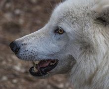
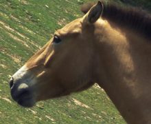
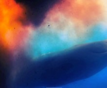
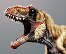
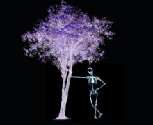
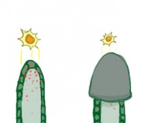
Create Your Own AI Images
The joy of using custom AI images crafted by algorithms is that they can be tailored to the unique landscape of your ideas. It’s akin to a personal artistic collaboration with a digital Picasso, where you provide the inspiration and the machine delivers a visual feast.
The magic begins with simple text prompts; imagine whispering secrets into the virtual ether and watching as an array of bespoke graphics materializes before your very eyes.
This isn’t just about splashy visuals, it’s about precision—a laser-focused reflection of your scientific narrative brought to life in vivid, high-resolution clarity. Engage with this innovative medium and watch as your presentation leaps from the realms of informative to mesmerizing.
Harness the Power of Data Visualization
Let’s pivot now to the art of data visualization—the storytelling prowess of charts, graphs, and infographics conveys numbers and statistics. Imagine strolling down a bustling city street; every sign, signal, and billboard is vying for your attention. Your data visualizations should be that compelling shop front that catches the eye.
Within these visuals lies an opportunity to transform abstract figures into revelatory insights as tangible as coins in hand. The intricate dance of lines and bars in a graph translates complex data relationships into harmonious rhythms anyone can follow.
Infographics act like visual essays, breaking down sophisticated concepts into bite-sized narrative chunks that even passersby would pause to ponder over. Occupy this space wisely and your message will not just resonate—it will echo long after the lights dim on your presentation.
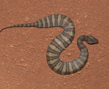
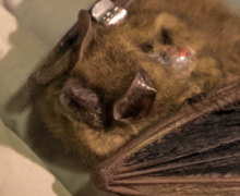
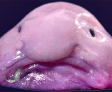
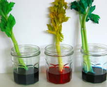
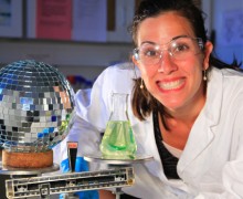
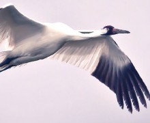
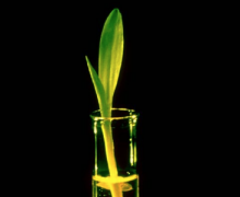
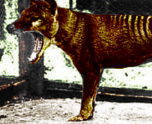
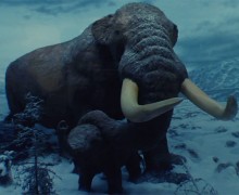
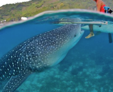
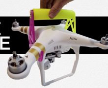
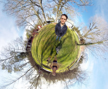
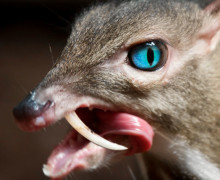
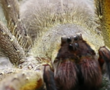
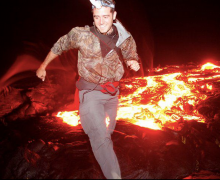
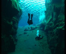
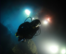
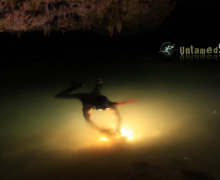
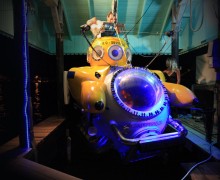
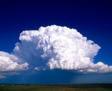
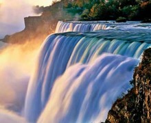
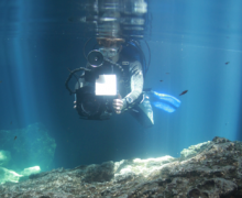
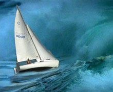
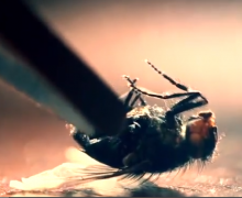
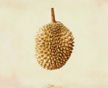
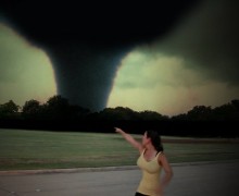
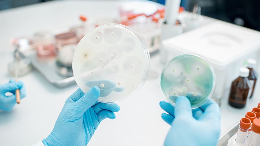
Photography: The Window to Real-World Science
Step away from the abstract and let photography throw open the shutters to reality. Photos serve as windows, offering clear glances into actual scientific phenomena—no imagination necessary. Like finding a familiar face in a crowd, these real-world snapshots can anchor your audience’s understanding with something tangible, so long as you use the right equipment.
Whether it’s the electrifying dance of auroras or the intricate weavings of neural networks, photographs lend authenticity to your narrative that illustrations might not capture. Use them judiciously; they’re the documentarians in your visual storytelling arsenal. By stitching together this tapestry of genuine moments, you create a backdrop where concepts aren’t just explained but felt and experienced.
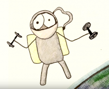
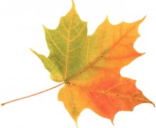
Sketching It Out: The Human Touch
Now, imagine rolling up your sleeves and drawing your visions directly onto the canvas of your presentation. Sketches and hand-drawn illustrations provide a raw, organic touch that digital images often can’t mimic. This is finger painting for the scientific mind—a chance to connect deeply with your audience through the universal language of doodling.
Think of these sketches as the personal handwriting on a mailed letter; there’s an intimacy in their imperfection and humanity that resonates differently than typeface. When you sketch, you distill complexities into their essence, like turning a bustling carnival into a quiet conversation.
Integrate this human element, and watch how it breathes life into even the most molecular of subjects. Your audience won’t just see what you’re teaching; they’ll feel like they’re part of the creation process themselves.
Animated Insights: A Journey Through Time
Now, let’s dive into the dynamic world of animation—the realm where static images are infused with the pulse of life. Think of an animation as a time machine; it can condense eons into seconds, allowing your audience to witness evolution unfold or galaxies collide before their next breath.
Animations in presentations act like silent film stars, gesturing and emoting to convey your message without uttering a single word. They take viewers on a narrative journey, from hypothesis to conclusion, in a format that’s especially handy for depicting processes and changes over time.

Wrapping Up
This has simply been a swift intro to your options when it comes to illustrating your science presentation – it’s up to you to pick a route that suits your skill set and your needs, and follow it through to fruition.