How Websites have Changed over the Last 20 Years
Technology really has changed rapidly over the last few decades. It’s also interesting to see that our attitudes towards tech have shifted as well. Marketing techniques that would never be used are now being utilized and on top of this, it would seem that things are opening up remarkably when it comes to website design.
Importance of Website Design
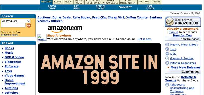
Website design is so important in this day and age. Website users are much savvier when compared to a few decades ago. They also don’t end up sticking around if a website is hard to use or if it is messy. UX and design is now more crucial than ever if you want to have a good website. So many people are used to having glossy or innovative website designs and it’s very easy to forget that things were not always this way. In fact, even the biggest giants out there, including Ebay and Amazon once had a very basic website design that is nothing like it is now. The live casino industry has also undergone a huge overhaul. Websites were once only able to support flash games but now they are able to support many diverse games, including blackjack, bacarrat poker streams as well as live tournaments.
Advances in Online Tracking
There have been a lot of advancements when it comes to online tracking. People can now track any information they want when it comes to online customer journeys. They can also build buyer personas and this is ideal for helping people to find a particular product or even a service. Websites are now using data like this so that they can make sure that they are doing their bit to attract the right customers. In the early days, the only thing that you had to think about is how your website looks on a computer monitor. Now there are so many devices out there and it’s safe to say that this has been a driving factor behind the general design of websites. Search engines are used much more frequently when it comes to mobile devices when compared to desktop, so designing websites for phone usage is now more important than ever.
Putting Mobile First

Mobile internet usage managed to surpass the usage on desktops in 2016. People now spend far more time browsing the internet on their phone when compared to using a desktop. If you want to make the most out of your marketing then you have to look at what kinds of devices are going to be used to access a site. This will help you to design a site better while also helping you to create a much more user-friendly experience. The mobile-first approach starts the design process at the mobile end. Designing a website around different mobile users brings its own set of challenges. When designers are able to overcome the restrictions that come with mobile, it’s then very easy to change things into a desktop version.
Of course, mobile usage has also meant that designers have to think about touchscreen technology. Most users aren’t using a mouse to navigate a website page and for this reason, website designers have to make sure that they are designing with a touchscreen in mind. They need to think about natural hand gestures and they also need to think about the action of typing, tapping and more. They also need to think about natural habits as well, and how easy it is to interact with on-screen elements. Crucially, users expect their website browsing to be as quick as it is on a laptop or a desktop and this has helped to change the way that websites are made in general.


